Tuesday, September 27, 2011

jamie magazine

Jamie magazine is a bimonthly published cooking magazine by English chef Jamie Oliver. The latest issue covers French cooking. What really stands out about this magazine is that it is printed on uncoated paper; this reflects Oliver and the kind of cook he is (rustic, organic, comfort food).. The layout is based on a 3 column grid that changes to 1 or 2 depending on the article (3/1 columns if it is a spread on recipes, 2/1 if is a text on restaurants or chefs). The photography is beautiful; so well done that it makes the readers mouth water every time. There is a harmonious mix of hand rendered and computer generated type. In the BOB there is always a commissioned illustration for a simple recipe. —Melisa Ozkan


Tim Walker- Pictures

This is my absolute favorite book, every time i go into Barnes and Noble I go to the fourth floor in the photography section and look at it for at least an hour. Pictures is a collection of photographs from the fashion photographer Tim Walker. His work has been published in many notable fashion magazines but are nothing like any typical fashion shoots. The images are always fantastical and tell a story. He loves to play with colors and size- often making normally pocket sized objects taller than a supermodel, or stringing hundreds of balloons to a century old mansion. His book contains his work and inspirations in the form of collages: he scanned his poems, his stories and sketches so we can see exactly how he creates the images he imagines. The layout ranges from full blown images, to images next to poems, or collages, negatives and sketches with his notes and doodles on everything. —Belinda Hale


Men’s Health

Health publications often cause for polarizing opinions. Many pressure individuals into having a certain look and oftentimes make one feel insignificant about their physical appearance. Similar to the Fashion Publication's portrayal of the unattainable clothing, Men’s Health causes readers to seek a goal in order to improve their current standard of living. Filled with advice for exercises, recipes (for food) and health tips, Men's Health is a magazine that claims to contain “Tons of Useful Stuff.” However despite this American sense of improving one’s self worth through physical appearance, I do find the magazine to be useful in providing many different exercises. The publication also has many clean and varied illustrations to provide their stories with a visual reference. —Michael Leng


Monday, September 26, 2011

The Believer

The Believer was created in 2003 and is currently published in San Fransisco 9 times a year. The magazine features book reviews by esteemed critics, interviews and articles of authors, writers, musicians and artists. The articles are very long and the inside spreads of the magazine are very dense with copy with a few simple black and white illustrations. The layouts inside are very classical and traditional looking – sans serif font, a very simple grid system, usually with two columns of text.

Contrastingly, the covers are very colorful and playful. They are completely illustrative and usually feature illustrations of famous people. I was interested in this magazine because it is very unlike other contemporary magazines that I have seen or read, which usually are very photographic and modern looking with more images than copy. –Donna Zitelli

Example of inside spread


InStyle Magazine

InStyle Magazine is a monthly women’s fashion and lifestyle magazine that features everything from beauty, celebrity news, lifestyle to fashion etc. Most of their layouts include fun and quirky typography with very little empty space. It is a wonderful source if you like hearing about new and interesting news around metropolitan areas like New York City or would like to have elements of that in your living space. The editorial content extends a very one on one advice column reach to the readers which makes the spreads very approachable and fun. Visually they update with a fun and positive outlook as well. —Huy Tran


Saturday, September 24, 2011

IDPURE Magazine Presentation

IDPURE is a magazine dedicated to professionals working in the graphic arts, images and design, as well as to those working in the areas of creation and visual communication. It is also addressed to people who are sensitive to and interested in their visual environments. IDPURE offers a comprehensive picture of the world of creation in Switzerland and abroad. It also provides a meeting place between professionels and customers in the domain. Primarily visual, IDPURE is designed to provide a source of information, inspiration and expression. (from website)

One of the most current works of swiss graphic design I've ever seen. It complements the works seen inside, with bold, contemporary use of Helvetica, grids and negative spaces. It's rare for such a publication to use text full body length so frequently - they seem to have pulled that off particularly well though. -Burak Nehbit


Design of this specific issue is different than its older issues - This might be a redesign or issue-specific work.

(Pink markings are mine)

The magazine alternates between a three-column layout (this) and a four-column one. (the one before)


Designer's Color Manual

Designer's Color Manual: The Complete Guide to Color Theory and Application by Tom Fraser and Adam Banks is an amazing book about everything color. The publication covers color in all forms, from color indoors, to color on the web, to color in art, to color in printing and so on. This is very important information for any designer, as color and the way it is perceived changes drastically depending on the medium and surroundings it is in. The book is designed cleanly and with, of course, a brilliant use of color. –Alex Bulloch

Cover
ToC


Sample Page

Wednesday, September 21, 2011

The Atlas of Possibility

The Atlas of Possibility for the Future of New York is a book that compiles all of the submissions to By the City / For the City's competition. The competition asked New Yorkers to share how “they think the city’s public realm could be designed to make it smarter, more beautiful and livable.” They were asked to finish the statement “Wouldn’t it be great if...” with their own suggestions on how New York's urban problems could be improved upon. These submissions are compiled in Atlas, making it a compelling book cataloging the hopes of everyday New Yorkers. Also included are the design responses to the challenges in New York’s public realm. Atlas aims to bring to the forefront issues in New York City and allow readers to see how things could change.—Charis Poon


GOOD Magazine Presentation

GOOD magazine is a quarterly print publication with a great online presence and a strong, verbal community. Contributing editors and writers are often professionals in their fields and passionate about good ideas. The print publication is designed in a way to stress these good ideas with large full color images, layouts with generous space and carefully considered advertisements. Nothing is too obtrusive and the design throughout is consistent. Graphics are particularly emphasized with a variety of illustrations and photographs.—Charis Poon

The logo on the cover is large and there is only one headline


There's a image based TOC that draws attention to the features in the magazine. The folio in the bottom left says what the issue’s theme is and the folio in the bottom right is the magazine's url.

Text TOC. The FOB is consistently three columns.

More three column layouts

The slugs in this issue all had to do with quantifying or qualifying since the issue has to do with data. The article on the right page shows the style used for the hed, dek, byline, and the prologue to the interview below.


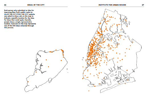
This article was unique in that it was mainly composed of images and captions.


GOOD does it’s best to use a variety of illustration styles. A pull quote is also seen here.

The BOB for this magazine is only one page. Everything before this except for one full spread photo is features in the well. This last page happens to be a happiness scale for the reader to use.

Tuesday, September 20, 2011

Marie Claire

This magazine has always been one of my favorites. It’s visually engaging, at least one of the tag lines always pulls me in, and they cater to young women. It’s a kind of magazine where you feel like you're getting advice from a good friend—the photography is sincere and charming instead of provocative and the products they promote are actually attainable for college students. Also, I’m in love with their font—especially the one used for the masthead and the articles are well designed and organized. —Belinda Hale