Monday, October 31, 2011

Zagat Survey (2010 Citi Edition)

With the debate currently circulating around “The Death of Print,” I would like to be one of the first people to mention this book to be one of the first casualties. There are many problems associated with a guide such as these that inhibit its effectiveness.

First of all, it is created on a per-year basis. This causes the publication to only be up to date as soon as it is finalized for printing. The new restaurant opening in 3 weeks across the street will not be anywhere in this book for you to gauge its reviews.

Also, this book falls into the category of “another object I must carry” or “pre-destined eating” (planning where to eat ahead of time) in order for the book to be utilized. Also, this particular book only features restaurants in New York City, it is essentially useless when travelling to other locations.

Apps, such as the Zagat app, will be replacing these publications as it allows for the information to be updated in real time, as well as the ease of being carried throughout. Combined with functions such as a search bar, user reviews and other features allow for an app to be more utilized than this book. –Michael Leng


Magazine Titles: Alex Caroline and Lauren

When I Grow Up
Future Gen
_TOPIA
Avenir
Data
2020
Digital
Pixels
Analog
NEXT
2100


- Alex, Caroline, Lauren

Wednesday, October 26, 2011

Front of Book Proposed Magazine Names

Tomorrow
F
The Forge
Fate
Flash
Inevitable
Approach
Unborn
TNT (Today & Tomorrow)
& Then

Tuesday, October 25, 2011

Possible Magazine Names

1. Future Thinking

2. Tomorrow

3. Tomorrow Today

4. Expectations

5. Fast Forward

6. Time Machine

7. Next Generation

8. Generation Z

9. Outlook

North Star Fund 2007 Annual Report

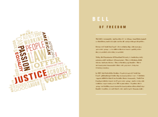
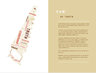
I came across this publication while searching for inspiration on the Internet and I was intrigued by the cover’s simplicity. I searched for the inside pages of the report and was equally as intrigued by the inside spreads as I was about the cover. The layout and design is very simple, but provocative. Each section begins with a beautifully designed image of an object that coincides with the title of the section that is made entirely of out type, similar to how it is done on the cover. For example, at the beginning of the section called “Hammer of Justice,” there is an image of a hammer on the left page that is made out of phrases and words that relate to the subject of the section, such as “community,” “organizing,” “building relationships,” “justice in courts.” The report follows this format throughout and I think it is very successful. —Donna Zitelli


Monday, October 24, 2011

International Designer Network

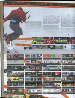
The publication, IDN is an interesting take on publication design. It mainly focuses on current trends of design. While the art is stunning in its own right, the layout also compliments the artwork well. It pushes the rules of design and it utilizes a non-conservative layout throughout the publication. Despite its lack of uniformity, the publication utilizes a multitude of design strategies throughout the book to make a stunning compilation for every issue. Although it lacks a consistent grid, the publication manages to utilize enough recurring themes to make the publication, as a whole, feel coherent. The most appealing aspect is how IDN is a fresh take on a genre that needed to further push boundaries. –Michael Leng


Wednesday, October 19, 2011

Volkswagen 2009 Jetta Clean Diesel Brochure

I came across this brochure design by Volkswagen and was very inspired by it. It was made for the 2009 Clean Diesel Jetta and is named Green Guts. This Jetta that the brochure is featuring uses emission-cleansing technologies and reduces fuel emission and pollution, while also staying powerful and fast. The designers of the brochure used imagery and form to illustrate these ideals of the car. Firstly, the shape of the brochure is geometric and strong, but there is an organic feeling to it also with its two curved corners, resembling a leaf. It is an accordion fold so when it is open it looks like a string of leaves or a vine. The title of the brochure, Green Guts, also covers the two main features of the Jetta – its environmental friendliness and its powerful strong attitude. Also on the cover and in several pages on the inside is an image of the car with tracks that are made of green grass. This shows that the Jetta is environmentally friendly and is leaving green tracks, in a figurative sense, on the Earth. The typography and layout is simple and clean, which is appropriate for advertising a clean, fast car. My favorite part about this brochure is how they were displayed at the Volkswagen dealership. They were attached to white sticks and stuck into a green table – as if they were flowers or plants. So cool! – Donna Zitelli


Tuesday, October 18, 2011

The Giving Tree by Shel Silverstein

Most children of our generation have grown up on this book. I was recently reminded of it in a television show I was watching, and came across it in barnes and noble a few days ago. It's a very simple book, but it's powerful. The illustrations and text work perfectly together, which I had some trouble with in this project. It reminded me that something so simple can feel very complete, and is often more striking than something overcomplicated with too many bells and whistles. For those who do not know this book, the story is about a tree and a boy, and as the boy grows up he takes and takes from the tree; but because the tree loves him so much- he lets him- until there is nothing left of the tree is a stump, and the boy is grown and aged. —Belinda Hale


Monday, October 17, 2011

The Standard 4: Scoring and Folding

The Standard is a publication produced by the paper company Sappi. Each edition of The Standard focuses on a particular area of printing and design process. In this edition, it focuses on the different techniques of scoring and folding paper. What I really like about this demo book is that it is very interactive. As you flip through each page, there is something for you to expand, fold, pull out, and transform. The book also includes folding samples that readers can hold and try themselves. It ends with a wall size poster that shows all the folding techniques at a glance. The way each chapter is assembled is a folding demonstration in itself. - Sara Chou


IKEA Catalog

The Ikea Catalog is an annual catalog published by IKEA. I chose to write about this publication because I think as an image-based publication, it's really successful. The main purpose of the IKEA Catalog is to showcase the furnitures and persuade people to buy them. It employs Verdana as the main font, a simple and straightforward font that is usually thought of as the "default font." However, in my opinion, the font works in this case because IKEA Catalog is aiming to appeal to the mass public, and it does by using such a generic typecase. Inside the catalog, the photographs are the main focus, and on top of each item is a simple and easy to read price and description. It's easy to read, the simple font and description gets the point across clear and fast, which is what the catalog aims for. —Sara Chou


Sunday, October 16, 2011

Rolling Stone

Rolling Stone magazine is devoted to music, liberal politics, and popular culture that is published every two weeks. Founded in San Francisco in 1967 by Jann Wenner, who still stands as editor and publisher and music critic Ralph J. Gleason. Focuses on young television or film actors. In recent years, the magazine has resumed its traditional mix of content, including in-depth political stories, and has seen its circulation increase. This months issue pays tribute to a young "Steve Jobs Nobody Knew" with an in-depth cover story written by Jeff Goodell who first met Jobs back in 1980. In addition, the issue has an essay about Jobs and his first serious girlfriend and the mother of their daughter Lsa Brennan-Jobs. – Anita Wong


Glamour

Glamour is a women's magazine published by Conde Nast Publications in 1939. Glamour gives a 360-degree perspective on the readers life. Relationships to career, clothes to her conscience, and pop culture and politics. It is a magazine for women looking to stay up on the latest trends, it is a magazine for every woman. Unfortunately, this months issue featured Kristen Stewart and her chopped off arm!

"Coco Perez questions how this serious oversight could have gone unnoticed. Indeed, it is really quite strange. Perhaps the rest of her arm was extended in an awkward way behind her leg, prompting photo editors to remove it, but the appendage’s disappearing act looks even more unusual! Slapped onto the left side of Kristen Stewart’s body is a big orange call-out that reads, “The Real Kristen Stewart: A Twilight Exclusive! New Secrets About Bella, Boys and What’s Next.” But even the promise of those secrets unveiled cannot disguise the big Photoshop flub."

This isn't the first photoshop flub Glamour has published. Last December issue featured Fergie with two different sized legs. – Anita Wong


BlackBook Magazine

BlackBook is an American arts and culture magazine. 8 issues are distributed throughout the year. BlackBook provides sophisticated, relevant, and visually stunning takes on restaurants, nightlife, travel, fashion, Hollywood, entertainment and the arts. This month's issue features Joseph Gordon-Levitt. BlackBook magazine asked Gordon-Levitt to REmix a couple of his photos that they shot for this issue. On his blog, Levitt asked his fans to draw on the provided photos, "write something over them, combine them with other images" found on hitRECord. The final mixes were submitted by September 1st. – Anita Wong


Tuesday, October 11, 2011

Things We Love- Kate Spade

Kate Spade’s Things We Love was presented to us last week in preparation for our catalogue assignment. It is a collection of inspiration images. What I love about it is the size, the images and all of the special textured elements that make it feel like a scrapbook. Although the images vary from different time periods and the font is also changed throughout it still feels very cohesive, which is something I want to try and play with through this next assignment. I also like how each spread has a conversation with each other, each coinciding page relates in an unexpected way—like the NYC night lights and the vintage polka dot gloves that mimic the street lights or the sequined pump and the sparkler. —Belinda Hale