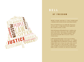
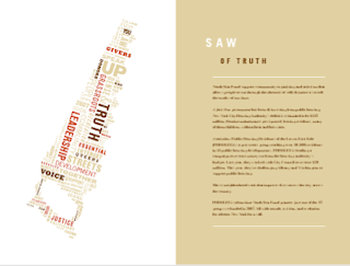
I came across this publication while searching for inspiration on the Internet and I was intrigued by the cover’s simplicity. I searched for the inside pages of the report and was equally as intrigued by the inside spreads as I was about the cover. The layout and design is very simple, but provocative. Each section begins with a beautifully designed image of an object that coincides with the title of the section that is made entirely of out type, similar to how it is done on the cover. For example, at the beginning of the section called “Hammer of Justice,” there is an image of a hammer on the left page that is made out of phrases and words that relate to the subject of the section, such as “community,” “organizing,” “building relationships,” “justice in courts.” The report follows this format throughout and I think it is very successful. —Donna Zitelli


No comments:
Post a Comment