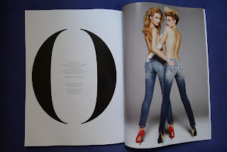
Vs. is a bi-annually published, American/international high-end fashion magazine geared toward a fashion forward reader. The large format print (11" x 14.5" in) makes Vs. stand out in the media. Vs. has a clean, minimal style that is consistent throughout the magazine; starting form the cover. The cover consists of the Vs. logo and a short cover line, what stands out is the beautiful image.
The FOB consists of the table of contents, the editors note, several articles and interviews.
The Well has a long interview with whoever is on the cover of the issue. The BOB is left for all the fashion spreads.
Being a fashion magazine Vs. gives great importance to photography and does not overwhelm the spreads with too much body text. Their layout is based on a 3 column grid that switches to a 2 columns depending on the type of article. The department head is always on the top left or right corner of the slug leading to the deck and body text with a thin aesthetic line.
Vs. magazine alos has their own typeface. It reflects their design esthetic perfectly, for some spreads they blow up the type to the size of the page and it is beautiful on its own. Also towards the BOB there is less and less text, all the articles are at the FOB so the rest is all about the clothes and photography. —Melisa Ozkan


No comments:
Post a Comment